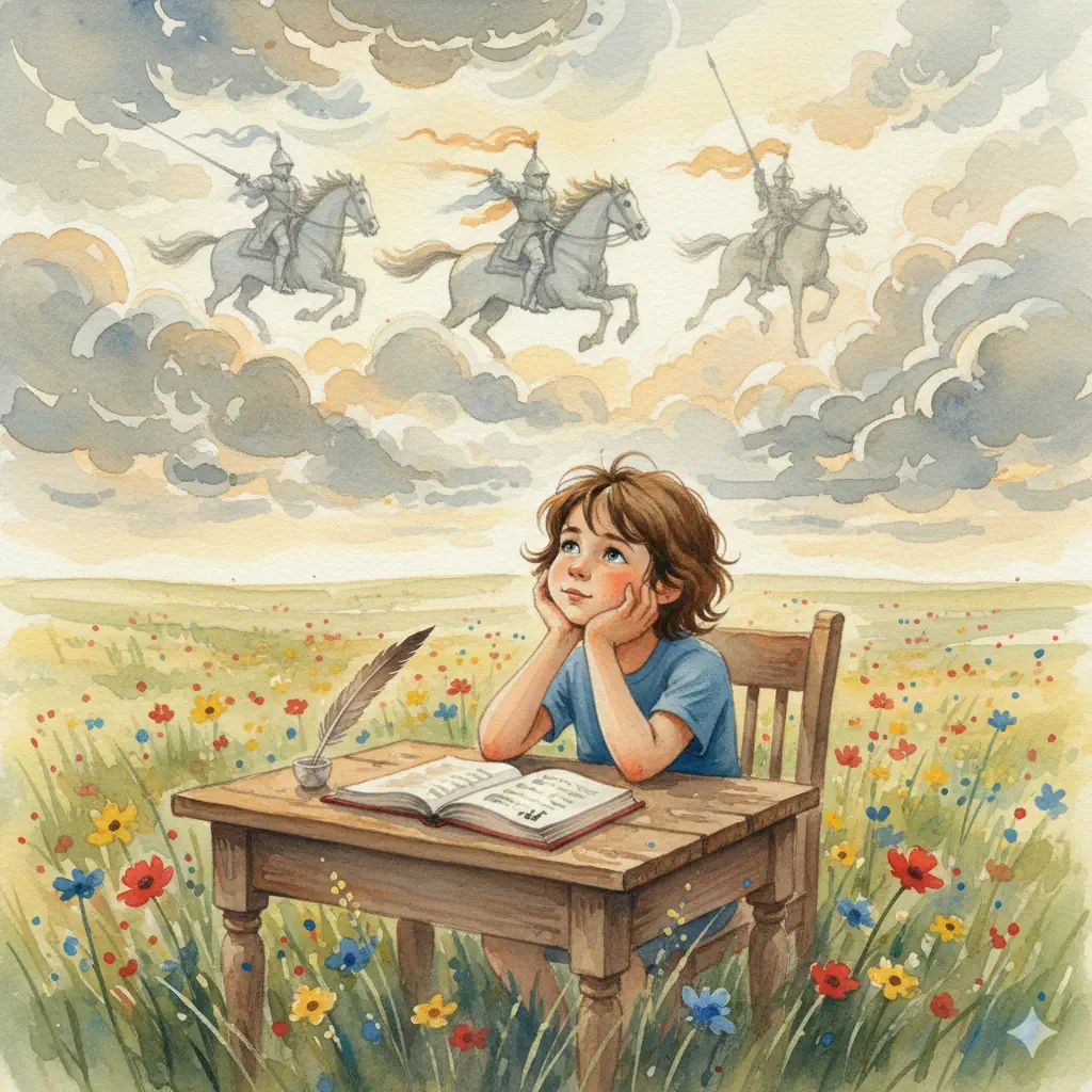
When my big boys were newborns my husband and I couldn’t get over the designs printed on newborn nappies. At the time beautiful watercolour images of Winne the Pooh or Snugglepot and Cuddlepie were the thing and they were just that, beautiful. But what purpose did they serve?
Did they do anything for the newborn? A newborn can only see 30cm from its face and has virtually zero neck control. So, definitely not.
Did they elicit a “warm and fuzzy” in the new mum? Almost certainly. Unless, of course, the mum was a highly pragmatic engineer like yours truly (but, just between you and me, the little girl’s heart in me did jump a beat the first time I saw them).
The marketing gurus at the nappy company know this very well. And they also know who has the bank account and the power to spend it down. It’s definitely not the chubby little bundle of joy for which their product is supposedly intended.
A lot of homeschool curriculum (and actually, even traditional school curriculum, for that matter) is designed with the same marketing philosophy. While virtually all homeschool parents are in it for their children’s best interests, they are still humans with their own tastes, inclinations and biases. And the marketing gurus know, and exploit, this.
Now, I’m not saying that all designers of beautiful curriculum have bad intentions. Indeed, the homeschool market is full of curriculum designed by home school mums who are (or have been) busy at the coalface, facing the same everyday issues as you. But often, it’s difficult for a creator to step out of their own perspective and see their work through the eyes of someone else. While they may have excellent artistic or graphic design skills, they can be so focused on making a page engaging that they are unaware their design is actually a distraction from the key lesson – especially for a child with special needs.
Even seemingly simple designs that employ a lot of colour can be a problem for students with learning challenges. I have a few boys in my tutoring practice that love to look at colourful books. But that’s just it. LOOK AT. Nothing more. Put fancy colour images in a workbook and they’ll sit there and stare at it all day but if you expect them to actually WORK in that book…. Get ready for a fight! Reversing a tide would often be easier.
The key is to find a balance. A few well placed, and functional, images can help both with engagement and retention as well as making explanations clearer to the struggling student. Colour, when it makes a difference to the explanation, can also be useful. But beyond that, a clean, high contrast layout is supreme.
Such a layout can follow a consistent and familiar pattern from lesson to lesson which is crucial for many young children, not just those with special needs. It also allows the key message to take centre stage ensuring maximum learning efficiency. And, most importantly for mum, it means that little time is wasted on staring at the beautiful imagery so the lesson can be over and done with in minimum time with minimum fuss.
But there’s one other benefit that perhaps eclipses them all. We’re putting the actual learning on centre stage. We’re not hiding it behind a complex set of beautiful images. This sends a subtle, yet powerful signal, to the child. Learning is its own reward. The joy of learning is the joy of discovery. It’s only when the child realises this that any “lifelong” learning is every going to take place.
I’ve heard it many times direct from the mouths of youngsters studying levels B and C at the “right time” as well as 17 year old special needs students studying level C of Milestone Maths: “Maths is fun because of your books!”
Say goodbye to curriculum overwhelm. Discover a curriculum designed to put learning first.


